Trustworthy helps families organize, protect, and optimize important information all in one place.

Trustworthy helps families organize, protect, and optimize important information all in one place.

Trustworthy helps families organize, protect, and optimize important information all in one place.

Team

Team

Team

Trustworthy

Trustworthy

Trustworthy

Oct 2021 - June 2023

Oct 2021 - June 2023

Oct 2021 - June 2023

Role

Role

Role

Lead product designer

Lead product designer

Lead product designer

Contribution

Contribution

Contribution

User research

User research

User research

Product design

Product design

Product design

Prototyping

Prototyping

Prototyping

Design system

Design system

Design system

iOS design

iOS design

iOS design
Web design

Web design

Web design

View live app

View live app

View live app

View live app

01 — Mobile parity

01 — Mobile parity

01 — Mobile parity

Challenge

Challenge

Challenge

When I first joined Trustworthy, the mobile app was only positioned as a scanning tool to allow people to quickly upload their documents to their accounts. This left a lot of potential customers confused about what the purpose of the app was and why they needed it.

When I first joined Trustworthy, the mobile app was only positioned as a scanning tool to allow people to quickly upload their documents to their accounts. This left a lot of potential customers confused about what the purpose of the app was and why they needed it.

When I first joined Trustworthy, the mobile app was only positioned as a scanning tool to allow people to quickly upload their documents to their accounts. This left a lot of potential customers confused about what the purpose of the app was and why they needed it.

Approach

Approach

Approach

In redesigning the mobile app into more of a utility-based product, we focused on updating the mobile design system as well as enabling more functionality for each category.

In redesigning the mobile app into more of a utility-based product, we focused on updating the mobile design system as well as enabling more functionality for each category.

In redesigning the mobile app into more of a utility-based product, we focused on updating the mobile design system as well as enabling more functionality for each category.

Role & Team

Role & Team

Role & Team

Being one of the product designers on this project (out of 2) I also worked alongside the Head of Product, Lead QA Analyst, development team, and marketing team.
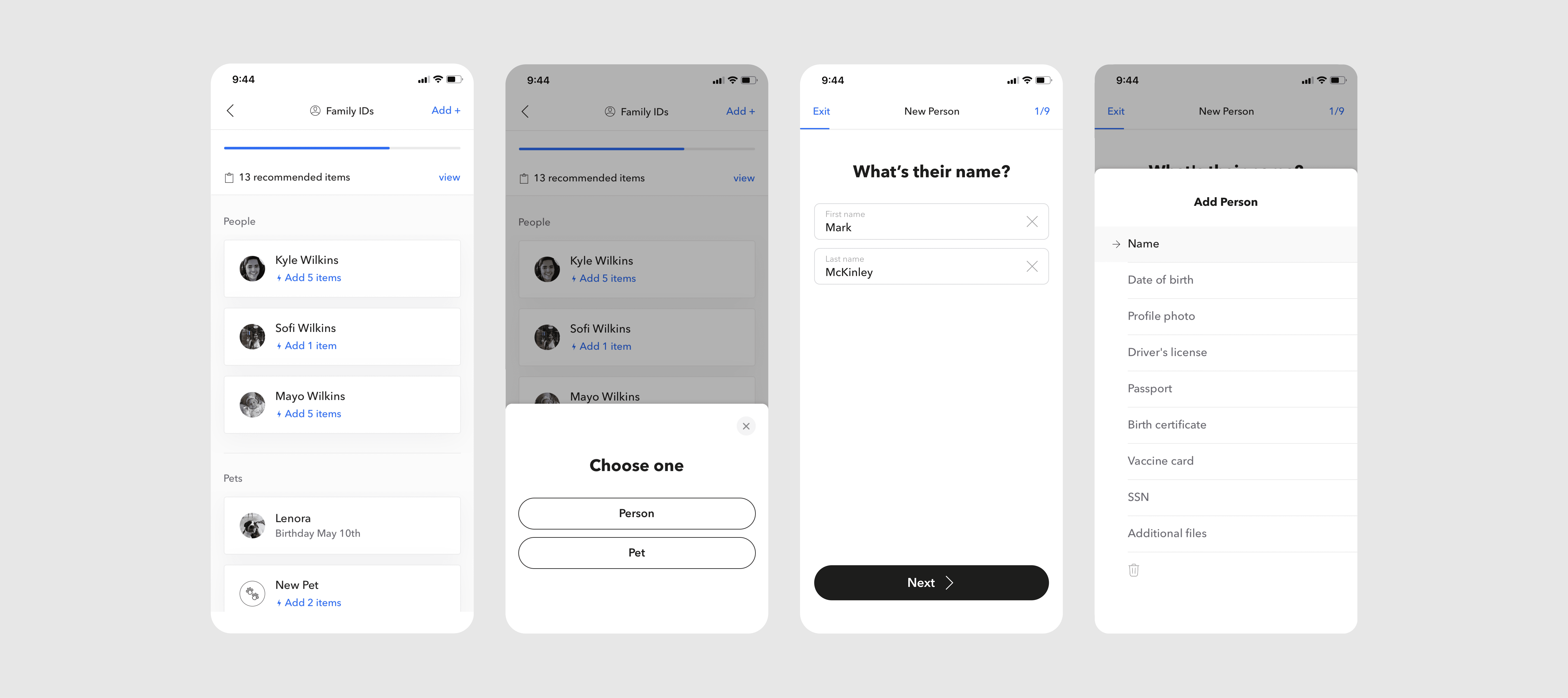
Being one of the product designers on this project (out of 2) I also worked alongside the Head of Product, Lead QA Analyst, development team, and marketing team.

Being one of the product designers on this project (out of 2) I also worked alongside the Head of Product, Lead QA Analyst, development team, and marketing team.

Main screens (For you, Dashboard, Scan, Browse, Account)

Main screens (For you, Dashboard, Scan, Browse, Account)

Main screens (For you, Dashboard, Scan, Browse, Account)

Main screens (For you, Dashboard, Scan, Browse, Account)

Main screens (For you, Dashboard, Scan, Browse, Account)

Main screens (For you, Dashboard, Scan, Browse, Account)

Category detail view with ability to edit info directly inside the app

Category detail view with ability to edit info directly inside the app

Category detail view with ability to edit info directly inside the app

Category detail view with ability to edit info directly inside the app

Category detail view with ability to edit info directly inside the app

Category detail view with ability to edit info directly inside the app

Guides & linking

Guides & linking

Guides & linking

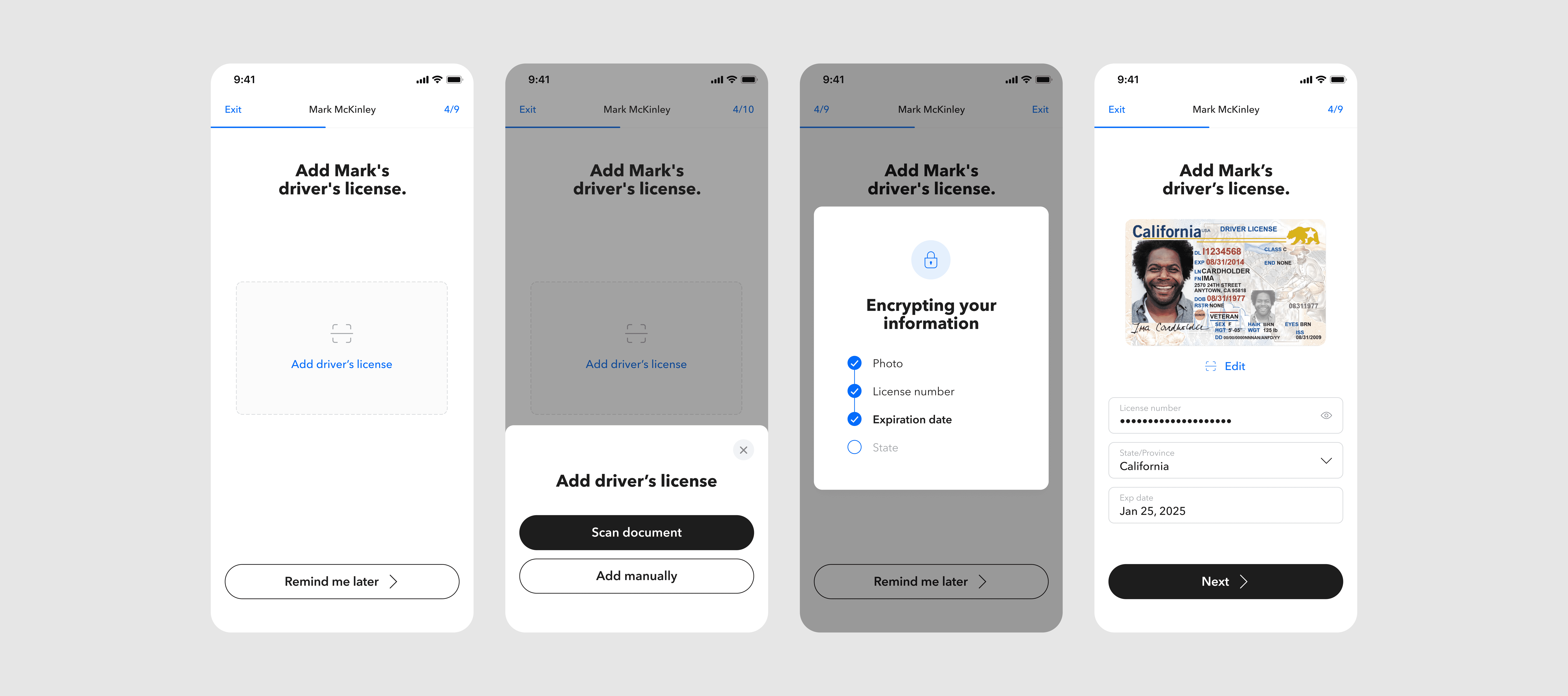
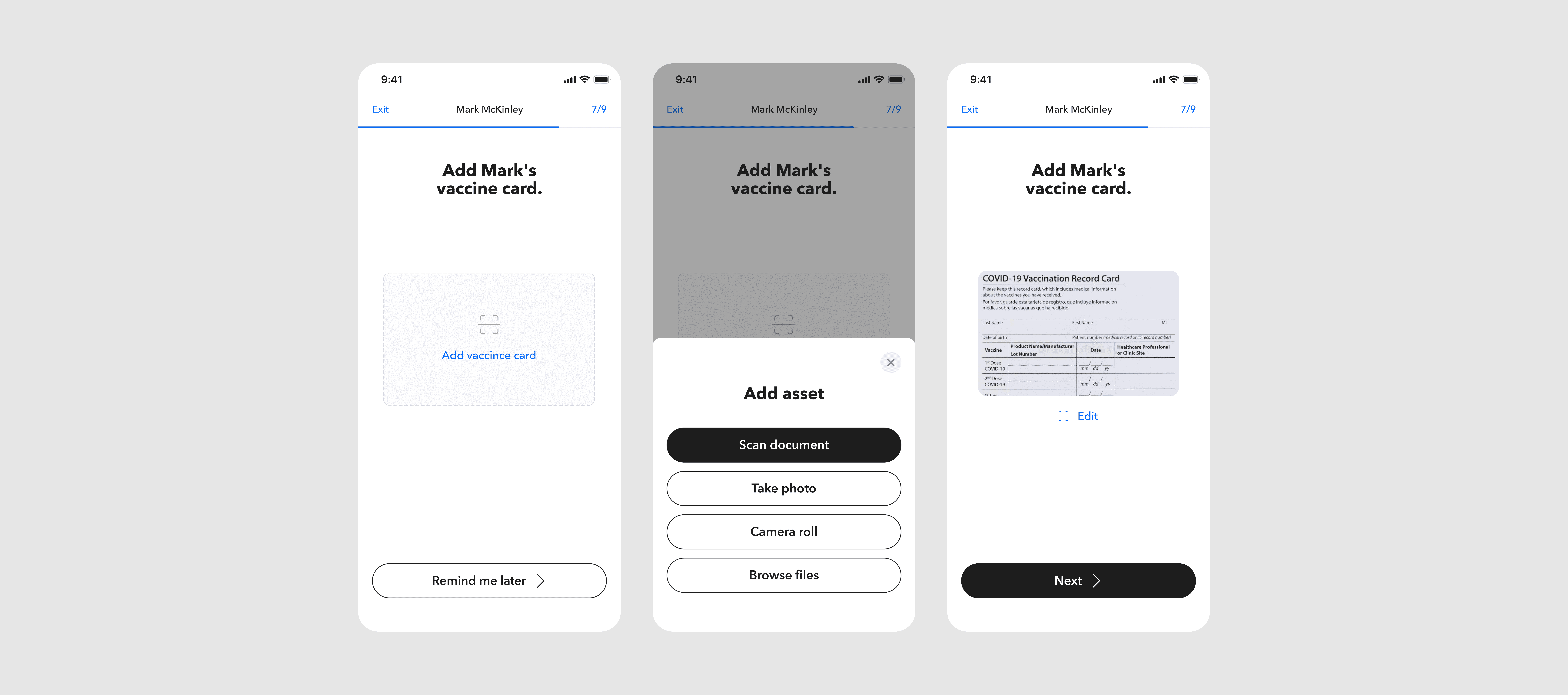
One key aspect of the mobile parity work was including category guide workflows. These guides help customers add key information while allowing them to link to other tiles in other categories.

One key aspect of the mobile parity work was including category guide workflows. These guides help customers add key information while allowing them to link to other tiles in other categories.

One key aspect of the mobile parity work was including category guide workflows. These guides help customers add key information while allowing them to link to other tiles in other categories.

Adding a new Real Estate tile from the Property category

Adding a new Real Estate tile from the Property category

Adding a new Real Estate tile from the Property category

Adding a new Real Estate tile from the Property category

Adding a new Real Estate tile from the Property category

Adding a new Real Estate tile from the Property category

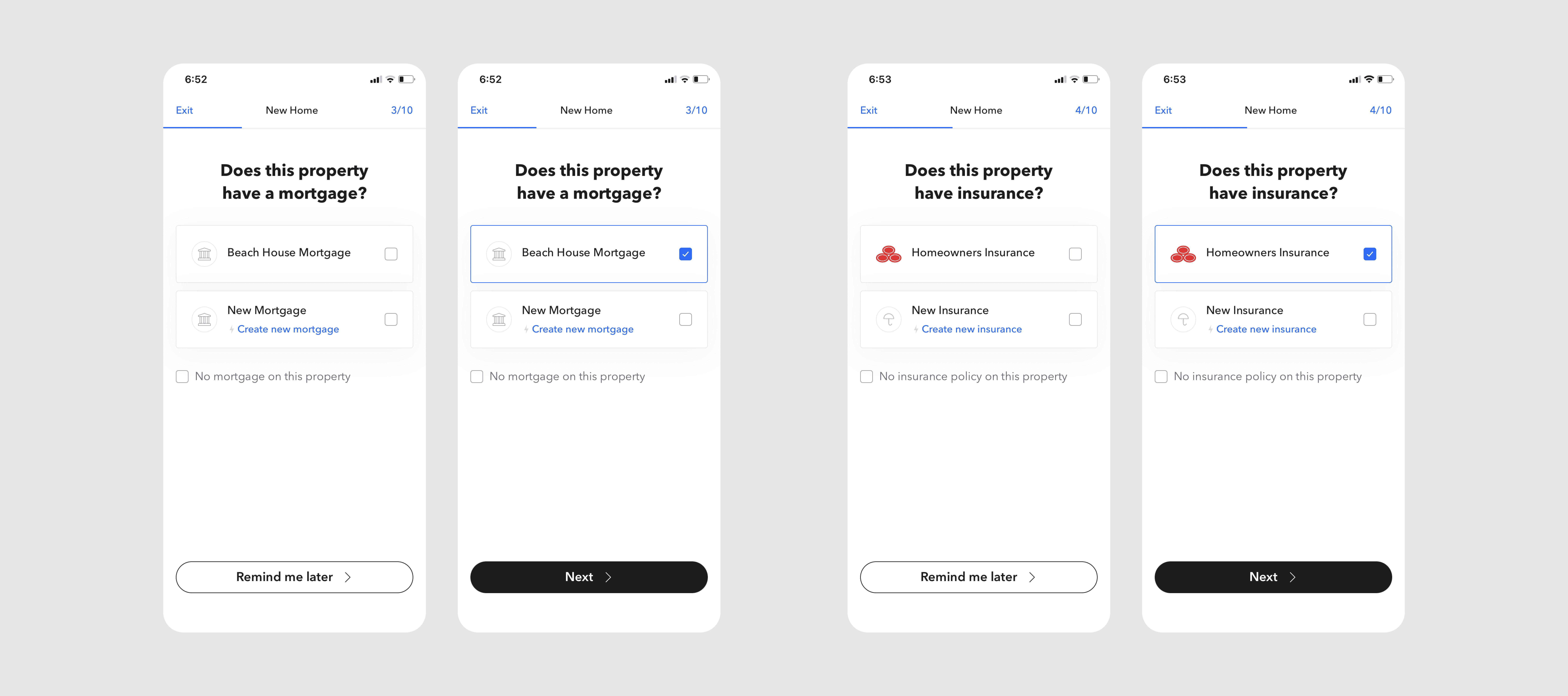
Example of linking Mortgages and Insurance to a home in a Property guide

Example of linking Mortgages and Insurance to a home in a Property guide

Example of linking Mortgages and Insurance to a home in a Property guide

Example of linking Mortgages and Insurance to a home in a Property guide

Example of linking Mortgages and Insurance to a home in a Property guide

Example of linking Mortgages and Insurance to a home in a Property guide

02 — Add collaborator flow

02 — Add collaborator flow

02 — Add collaborator flow

Challenge

Challenge

Challenge

Adding a collaborator is a large component of managing your Trustworthy account. You can allow an estate planner, family, or verified member to access your account, make changes, and even do tasks that are assigned for them to complete.

Adding a collaborator is a large component of managing your Trustworthy account. You can allow an estate planner, family, or verified member to access your account, make changes, and even do tasks that are assigned for them to complete.

Adding a collaborator is a large component of managing your Trustworthy account. You can allow an estate planner, family, or verified member to access your account, make changes, and even do tasks that are assigned for them to complete.

Approach

Approach

Approach

Working off of the web version, we focused on keeping the main flow of adding a collaborator while also providing information on what an All Access and Limited Access collaborator are.

Working off of the web version, we focused on keeping the main flow of adding a collaborator while also providing information on what an All Access and Limited Access collaborator are.

Working off of the web version, we focused on keeping the main flow of adding a collaborator while also providing information on what an All Access and Limited Access collaborator are.

Role & Team

Role & Team

Role & Team

Being the main product designer on this project, I also worked alongside the Head of Product, Lead QA Analyst, development team, and marketing team.

Being the main product designer on this project, I also worked alongside the Head of Product, Lead QA Analyst, development team, and marketing team.

Being the main product designer on this project, I also worked alongside the Head of Product, Lead QA Analyst, development team, and marketing team.

Adding an all-access collaborator flow

Adding an all-access collaborator flow

Adding an all-access collaborator flow

Adding an all-access collaborator flow

Adding an all-access collaborator flow

Adding a limited access collaborator flow

Adding a limited access collaborator flow

Adding a limited access collaborator flow

Adding a limited access collaborator flow

Adding a limited access collaborator flow

Adding a limited access collaborator flow

03 — Dashboard updates on web

03 — Dashboard updates on web

03 — Dashboard updates on web

Challenge

Challenge

Challenge

As the design system for both mobile and web were being updated, we also looked at redesigning the Dashboard on web. The goal was to address UX issues that customers were posing to the team while also updating to a sleeker and more concise layout.

As the design system for both mobile and web were being updated, we also looked at redesigning the Dashboard on web. The goal was to address UX issues that customers were posing to the team while also updating to a sleeker and more concise layout.

As the design system for both mobile and web were being updated, we also looked at redesigning the Dashboard on web. The goal was to address UX issues that customers were posing to the team while also updating to a sleeker and more concise layout.

Problem 1 — Lack of feeling of any progress made on account

Problem 1 — Lack of feeling of any progress made on account

Problem 1 — Lack of feeling of any progress made on account

The biggest issue was that the current dashboard listed every missing item in your fOS (Family Operating System). This would create a very long and cumbersome list that left customers feeling like they weren’t making progress.

The biggest issue was that the current dashboard listed every missing item in your fOS (Family Operating System). This would create a very long and cumbersome list that left customers feeling like they weren’t making progress.

The biggest issue was that the current dashboard listed every missing item in your fOS (Family Operating System). This would create a very long and cumbersome list that left customers feeling like they weren’t making progress.

To combat this, we changed the “Missing information” section to “For you” which only showed items that were assigned to that individual. We also changed the progress meter to a “Total items” module that kept track of the totality of one’s account. These changes helped condense the list of missing info and make your account feel more manageable.

To combat this, we changed the “Missing information” section to “For you” which only showed items that were assigned to that individual. We also changed the progress meter to a “Total items” module that kept track of the totality of one’s account. These changes helped condense the list of missing info and make your account feel more manageable.

To combat this, we changed the “Missing information” section to “For you” which only showed items that were assigned to that individual. We also changed the progress meter to a “Total items” module that kept track of the totality of one’s account. These changes helped condense the list of missing info and make your account feel more manageable.

Problem 2 — Reminders and collaborators are hard to find

Problem 2 — Reminders and collaborators are hard to find

Problem 2 — Reminders and collaborators are hard to find

Viewing reminders and managing collaborators is a big part of your fOS. In the current dashboard, customers reported that these were hidden and wanted to see them more front and center.

Viewing reminders and managing collaborators is a big part of your fOS. In the current dashboard, customers reported that these were hidden and wanted to see them more front and center.

Viewing reminders and managing collaborators is a big part of your fOS. In the current dashboard, customers reported that these were hidden and wanted to see them more front and center.

To remedy this, we added reminders and showed your collaborators on the right panel of the dashboard. We also moved the concierge section to a link button which improved the hierarchy of the page for easier scanning.

To remedy this, we added reminders and showed your collaborators on the right panel of the dashboard. We also moved the concierge section to a link button which improved the hierarchy of the page for easier scanning.

To remedy this, we added reminders and showed your collaborators on the right panel of the dashboard. We also moved the concierge section to a link button which improved the hierarchy of the page for easier scanning.

Role & Team

Role & Team

Role & Team

Being one of the product designers on this project (out of 2) I also worked alongside the Head of Product, Lead QA Analyst, development team, and marketing team.

Being one of the product designers on this project (out of 2) I also worked alongside the Head of Product, Lead QA Analyst, development team, and marketing team.

Being one of the product designers on this project (out of 2) I also worked alongside the Head of Product, Lead QA Analyst, development team, and marketing team.

Before and after of the Dashboard redesign

Before and after of the Dashboard redesign

What's next — Supercharged scanning

What's next — Supercharged scanning

What's next — Supercharged scanning

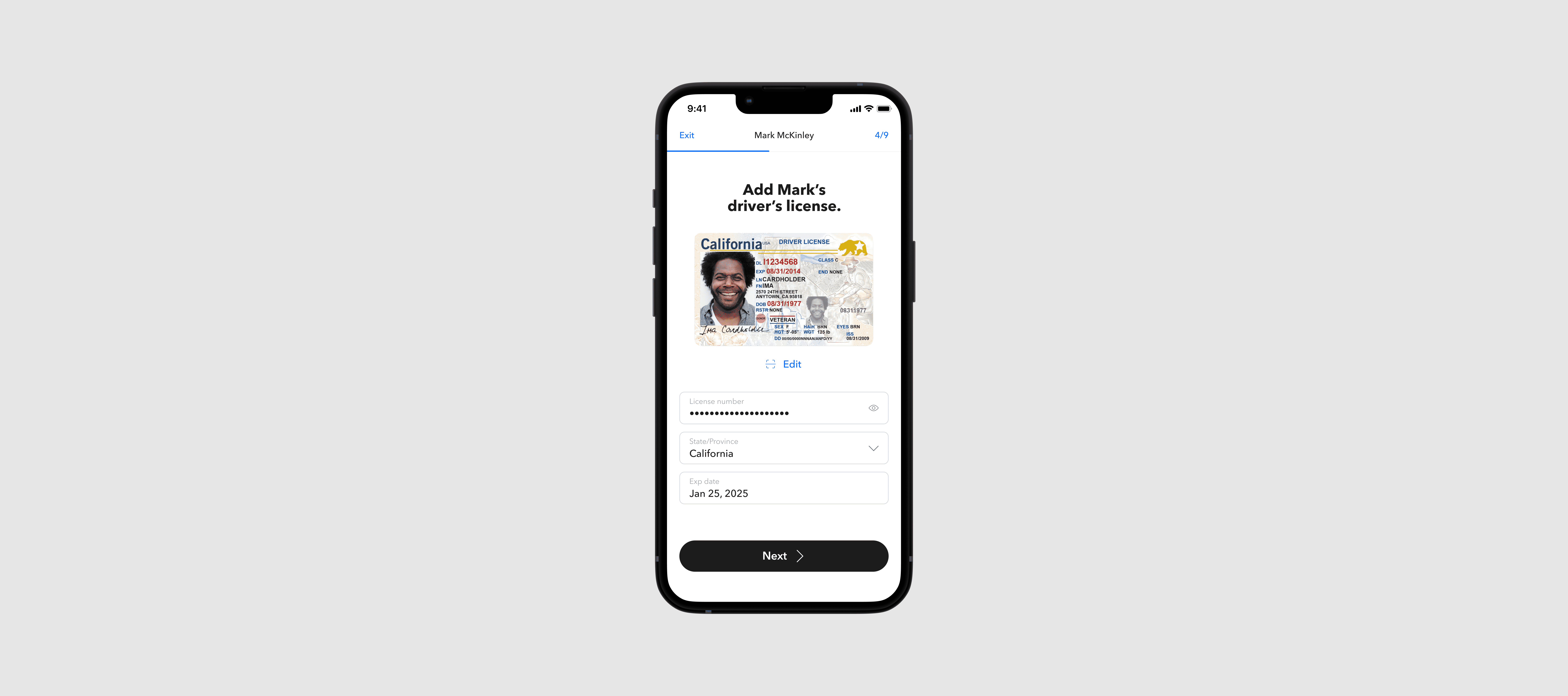
Before I departed from Trustworthy, the team and I were excited about updating the scanner to identify where information could be added more efficiently. This new scanning feature would help speed up the workflow for adding IDs, licenses, passports, and more as customers can quickly scan and upload their info while being prompted suggestions on where that info can live.

Before I departed from Trustworthy, the team and I were excited about updating the scanner to identify where information could be added more efficiently. This new scanning feature would help speed up the workflow for adding IDs, licenses, passports, and more as customers can quickly scan and upload their info while being prompted suggestions on where that info can live.

Before I departed from Trustworthy, the team and I were excited about updating the scanner to identify where information could be added more efficiently. This new scanning feature would help speed up the workflow for adding IDs, licenses, passports, and more as customers can quickly scan and upload their info while being prompted suggestions on where that info can live.

View live app

View live app

View live app

View live app