State Farm came to YML with a challenge; to streamline a complex experience into something simple, practical, and sleek.
State Farm came to YML with a challenge; to streamline a complex experience into something simple, practical, and sleek.
State Farm came to YML with a challenge; to streamline a complex experience into something simple, practical, and sleek.
Role
Role
Role
Product designer
Product designer
Product designer
Project type
Project type
Project type
Redesign
Redesign
Redesign
Timeline
Timeline
Timeline
8 months
8 months
8 months
Contribution
Contribution
Contribution
User research
User research
User research
Product design
Product design
Product design
Prototyping
Prototyping
Prototyping
Design system
Design system
Design system
iOS & Android design
iOS & Android design
iOS & Android design
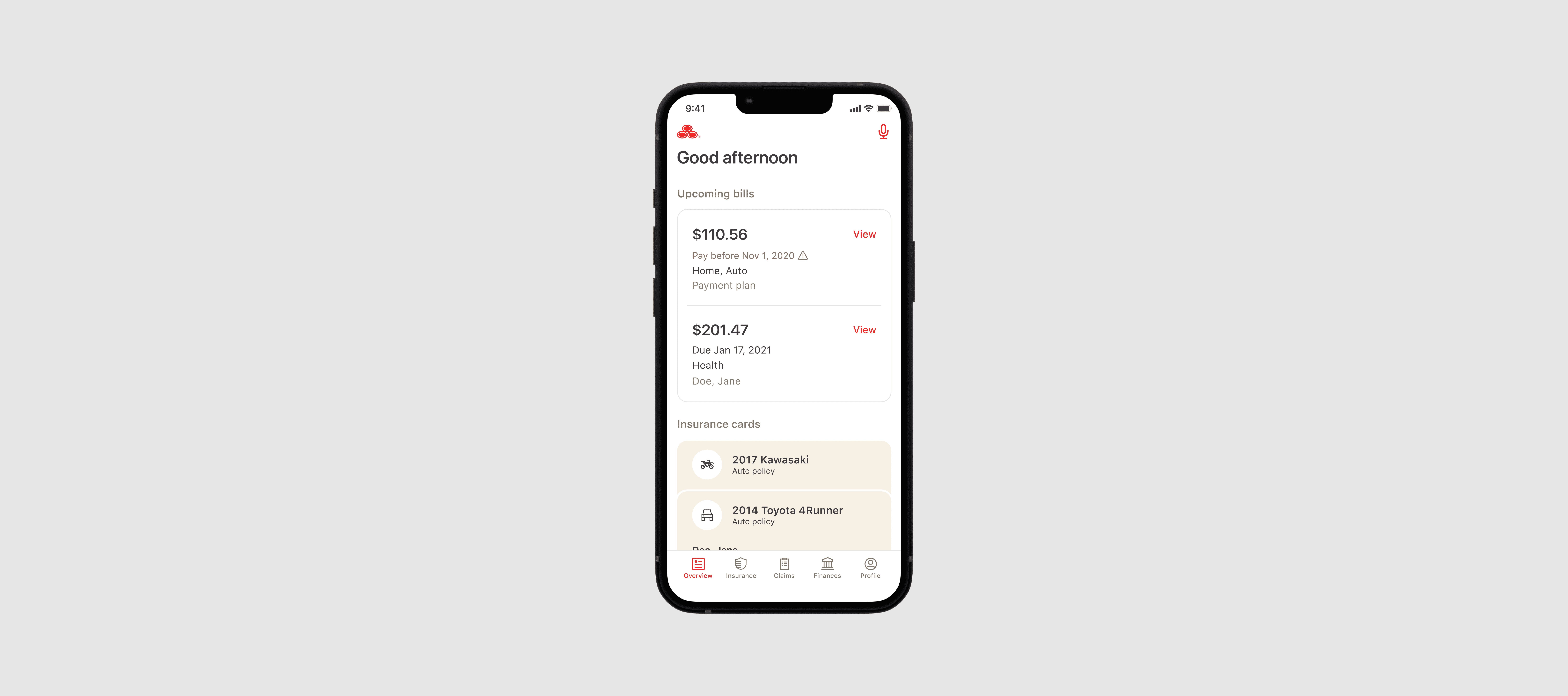
01 — Mobile app redesign
01 — Mobile app redesign
01 — Mobile app redesign
Challenge
Challenge
Challenge
State Farm wanted to revamp its app while addressing key UX issues and maintaining its unique brand.
State Farm wanted to revamp its app while addressing key UX issues and maintaining its unique brand.
State Farm wanted to revamp its app while addressing key UX issues and maintaining its unique brand.
Approach
Approach
Approach
We began tackling the project by overhauling the current UI to be friendlier, warmer, and more oriented toward users’ needs. The UI utilized approachable cards, an updated font that reflected the brand of State Farm, and colorful illustrations/icons. The updates provided breathing room for the important interactions for the app while reflecting the warmth and care of the State Farm brand.
We began tackling the project by overhauling the current UI to be friendlier, warmer, and more oriented toward users’ needs. The UI utilized approachable cards, an updated font that reflected the brand of State Farm, and colorful illustrations/icons. The updates provided breathing room for the important interactions for the app while reflecting the warmth and care of the State Farm brand.
We began tackling the project by overhauling the current UI to be friendlier, warmer, and more oriented toward users’ needs. The UI utilized approachable cards, an updated font that reflected the brand of State Farm, and colorful illustrations/icons. The updates provided breathing room for the important interactions for the app while reflecting the warmth and care of the State Farm brand.
Role & Team
Role & Team
Role & Team
As one of three product designers on this project, I worked alongside 1 product manager, 1 art director, and stakeholders from State Farm.
As one of three product designers on this project, I worked alongside 1 product manager, 1 art director, and stakeholders from State Farm.
As one of three product designers on this project, I worked alongside 1 product manager, 1 art director, and stakeholders from State Farm.
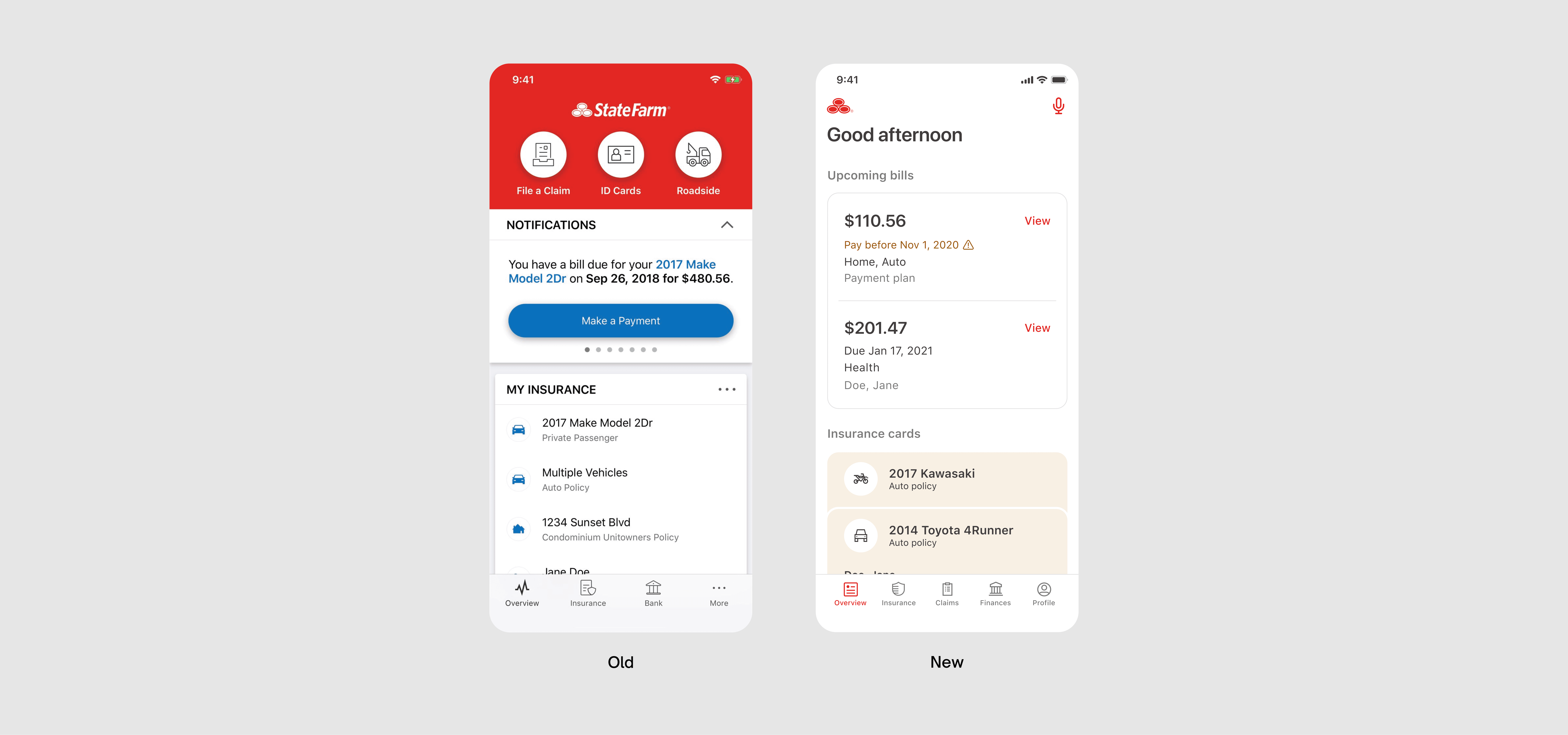


Before and after of the Overview screen
Before and after of the Overview screen
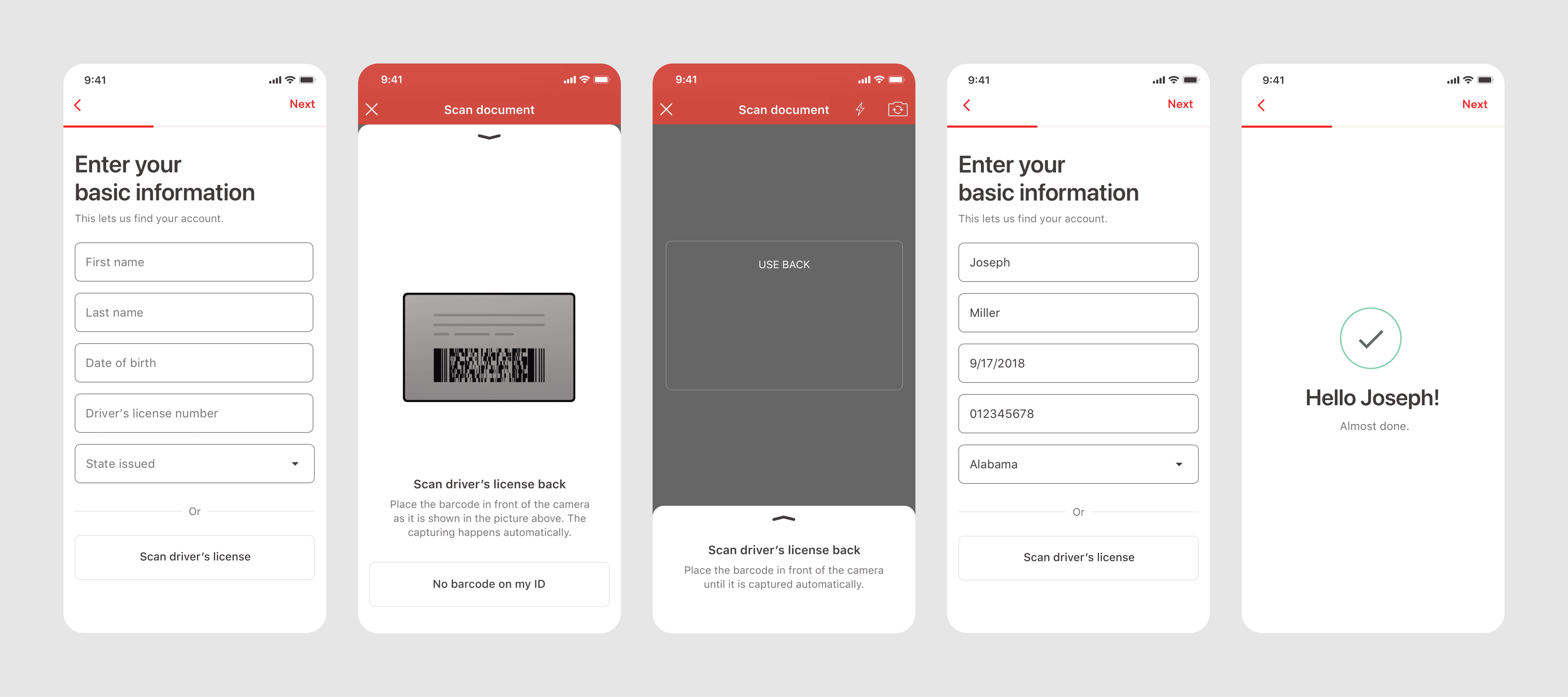
Driver's license scanner flow with progress meter
Driver's license scanner flow with progress meter
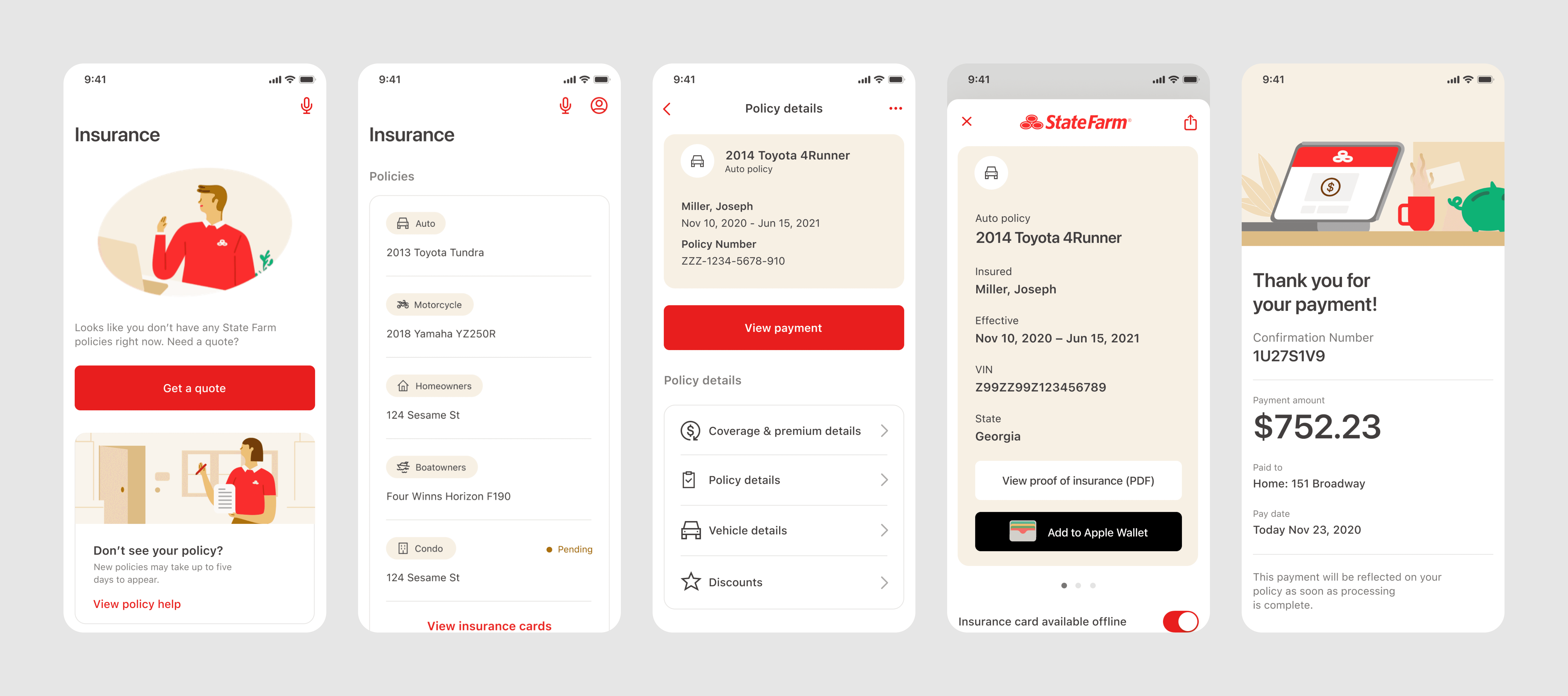
Insurance screens
Insurance screens
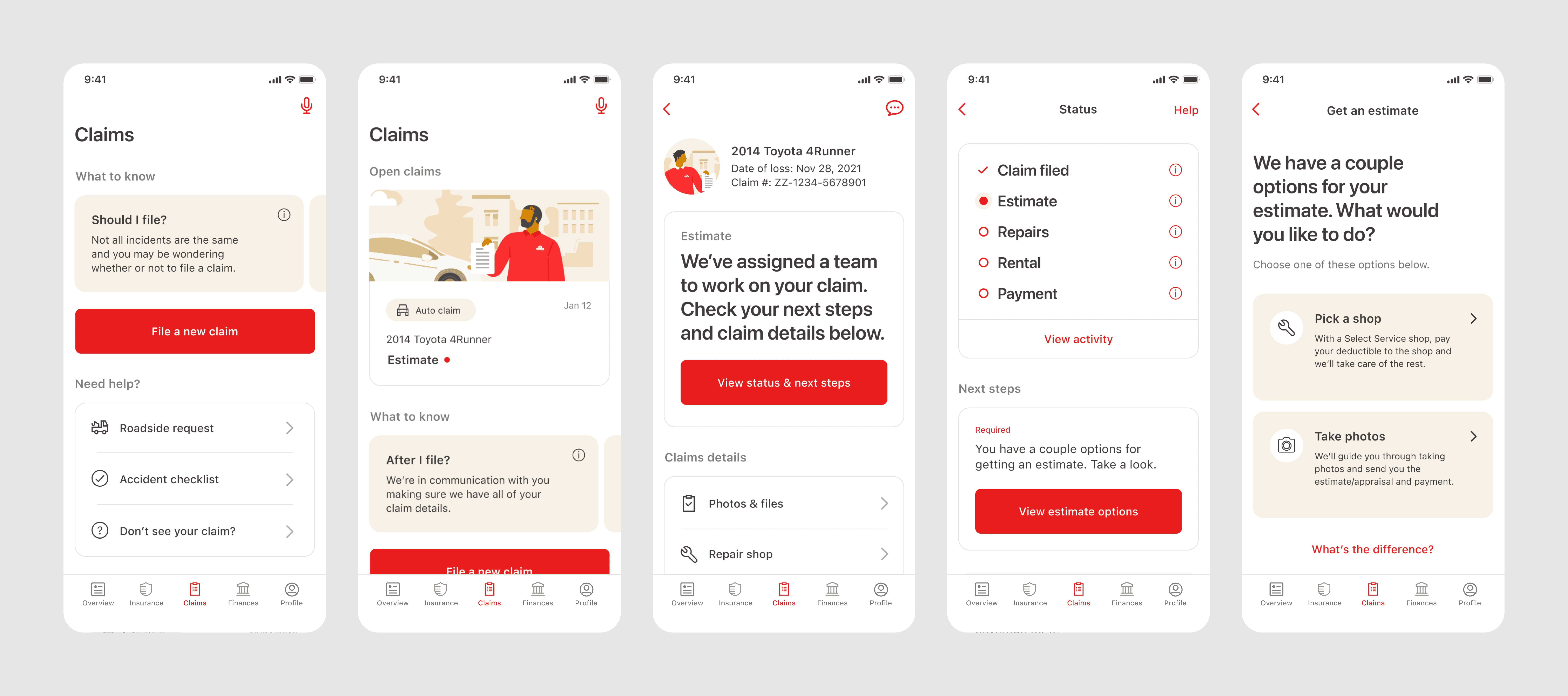
Claims detail screens
Claims detail screens
02 — Reception
02 — Reception
02 — Reception
4.8 Stars
4.8 Stars
4.8 Stars
Reviews from over 250k customers
Reviews from over 250k customers
Reviews from over 250k customers
1 Webby Award
1 Webby Award
1 Webby Award
People's Voice Winner
People's Voice Winner
People's Voice Winner
View live app